
Explore More


Web Builder Using Angular's Material CDK
In this article, we will cover how to create a basic drag-and-drop website builder using Angular (v18) and the Material Component Dev Kit (CDK). This Angular app is merely a proof-of-concept to convey the power and flexibility of using Angular's CDK library. The idea is to have a working concept of a GUI-based CMS, similar to many popular website builder sites.
DISCLAIMER: The example project was made with v18.2 of the ng Angular CLI tool as a standalone app (requires NodeJS v18.9 or higher). I used ChatGPT 4o to help me write the code for this AI website builder. Angular now generates apps and components as "standalone", by default, since version 17 of Angular.
Set Up the Angular Web Page Builder Project
We will need to create a new Angular app before we can start, and we will need the ng Angular CLI tool installed properly so that we can create a new project, and generate boilerplate code for things like new components.
Install the Angular CLI
Ensure the Angular CLI tool (ng) is installed and functioning properly. You can use the ng version command to get the Angular CLI version:
ng version

     _                      _                 ____ _     ___
    / \   _ __   __ _ _   _| | __ _ _ __     / ___| |   |_ _|
   / △ \ | '_ \ / _` | | | | |/ _` | '__|   | |   | |    | |
  / ___ \| | | | (_| | |_| | | (_| | |      | |___| |___ | |
 /_/   \_\_| |_|\__, |\__,_|_|\__,_|_|       \____|_____|___|
                |___/


Angular CLI: 18.2.2
Node: 20.17.0
Package Manager: npm 10.8.2
If it's not yet installed, then you can install it using npm with the following command:
npm install -g @angular/cli@18Create a New Angular Project
You can create a new project using the ng new command (see the CLI reference page for more details):
ng new website-builderNOTE: Make sure to replace website-builder with the name of your project, and make sure to have Angular enable routing for your new Angular app (when prompted)—it will save you a lot of work and time later.
This will generate the app, but you first you will have to go through a simple, text-based "wizard" where you will need to select options about routing, SSR (Server-Side Rendering), choosing Material, and selecting styles (like SASS).
Angular Material CDK Library
Install the Angular Material UI library, which is required for the drag-and-drop features of Material CDK. If you forgot to install Material, or the Angular CDK library, while creating your new app, then just add them with npm install:
npm install --save @angular/material @angular/cdk @angular/animationsYou can also try using the ng add command:
ng add --save @angular/materialTypeScript Models for the Web Builder
Before creating components, we should define models (TypeScript interfaces) so that TypeScript understands the data structure.
First, create a new elements.model.ts file (use a command like: touch src/app/shared/models/elements.model.ts), and the contents of the file should look like this:
export type ElementType = "header" | "paragraph" | "list";

export interface ElementModel {
  id: number;
  type: ElementType;
  content: string | string[];
}NOTE: As you expand upon your app, and add more base elements, you will need to add the new names to the type ElementType enumerated line.
Angular Components for the Web Page Builder
We're now ready to create some new components for the website builder!
Use the ng g c (or ng generate component) command to generate boilerplate files for a new standalone component. Here's the command to create the main route 'BuilderComponent' using the shortened syntax:
ng g c routes/builderNOTE: Since v17 of Angular, all newly generated web apps are standalone by default. If you're using an older version of Angular, then you will need to pass the --standalone flag (e.g. ng g c new-component --standalone) when executing the ng g c command to create a new component. See the latest Angular documentation on standalone migration for more details.
Contents of the Web Builder Component
The TypeScript code for the new web builder route component should look something like this:
// app/routes/builder/builder.component.ts
import { Component, ViewChild } from "@angular/core";
import { DragDropModule } from "@angular/cdk/drag-drop";
import { CommonModule } from "@angular/common";

import { CanvasComponent } from "../../shared/components/canvas/canvas.component";
import { ToolbarComponent } from "../../shared/components/toolbar/toolbar.component";
import { ElementModel, ElementType } from "../../shared/models/elements.model";

@Component({
  selector: "app-builder",
  standalone: true,
  imports: [CommonModule, DragDropModule, CanvasComponent, ToolbarComponent],
  templateUrl: "./builder.component.html",
  styleUrl: "./builder.component.scss",
})
export class BuilderComponent {
  @ViewChild("canvas") canvas!: CanvasComponent;

  onAddElement(event: { type: ElementType; content: string }): void {
    this.canvas.addElement(event);
  }
}
This allows for the TypeScript to access, and modify, the canvas element which will be used to render custom HTML elements.
HTML for the Angular Website Builder Component
The HTML for the web builder component's builder.component.html file needs to look something like this:
<div class="container">
  <app-toolbar (addElement)="onAddElement($event)"></app-toolbar>
  <app-canvas #canvas></app-canvas>
</div>
This will render the HTML canvas and toolbar components (which we will create next). Notice how the onAddElement() call will handle click events from the user.
SCSS for the Web Builder Component
You can have whatever CSS layout you want, but here's some example SCSS of how you might render the HTML canvas:
/* routes/builder/builder.component.scss */
.container {
  display: flex;
  height: 100vh;
  width: 100vw;
}

.canvas {
  flex: 1;
  padding: 20px;
  border: 1px solid #ccc;
  overflow-y: auto;
}

.cdk-drag-preview {
  /* Styling for the preview of the dragged element */
  box-shadow: 0 5px 10px rgba(0, 0, 0, 0.2);
  background-color: #fff;
  padding: 10px;
}

.cdk-drag-placeholder {
  /* Placeholder style when an element is dragged */
  background: #f0f0f0;
  border: 1px dashed #ccc;
}

.cdk-drag-handle {
  cursor: move;
}
Web Builder Canvas Component
Let's do the CanvasComponent next!
Use the ng g c shared/components/canvas command to create the files for the canvas, which will eventually render all of the custom elements created by the user.
TypeScript for the Canvas Component
The bulk of the business logic will be found in this CanvasComponent TypeScript file, as it will need to take care of adding, removing, and dragging custom user elements.
It should look like the following:
// shared/components/canvas/canvas.component.ts
import { Component, OnInit } from "@angular/core";
import { CommonModule } from "@angular/common";
import { DragDropModule, CdkDragDrop, moveItemInArray } from "@angular/cdk/drag-drop";

import { ElementModel, ElementType } from "../../models/elements.model";
import { ElementComponent } from "../element/element.component";

@Component({
  selector: "app-canvas",
  standalone: true,
  imports: [CommonModule, DragDropModule, ElementComponent],
  templateUrl: "./canvas.component.html",
  styleUrls: ["./canvas.component.scss"],
})
export class CanvasComponent implements OnInit {
  elements: ElementModel[] = [];
  private idCounter = 0;

  ngOnInit(): void {
    // Example elements to start with
    this.addElement({ type: "header", content: "Header Example" });
    this.addElement({ type: "paragraph", content: "Paragraph text example." });
  }

  addElement({ type, content }: { type: ElementType; content: string }): void {
    const newElement: ElementModel = {
      id: this.idCounter++,
      type,
      content: type === "list" ? content.split(",") : content,
    };
    this.elements.push(newElement);
  }

  drop(event: CdkDragDrop<ElementModel[]>): void {
    moveItemInArray(this.elements, event.previousIndex, event.currentIndex);
  }

  // Delete an element from the canvas
  removeElement(index: number): void {
    this.elements.splice(index, 1);
  }
}
In the above example, the ngOnInit(): void { ... } code block contains some method calls to add a few default custom elements for when the app loads in a web browser.
The bulk of the @angular/cdk/drag-drop actions, and method calls, will take place here.
HTML for the Canvas Component
The canvas HTML will loop over the elements and render the individual <app-element> component instances (to be covered later in the article):
<!-- shared/components/canvas/canvas.component.html -->
<div class="canvas" cdkDropList (cdkDropListDropped)="drop($event)">
  <ng-container *ngIf="elements.length > 0; else placeholder">
    <div class="ele-container" *ngFor="let element of elements; let i = index" cdkDrag>
      <app-element [element]="element" (delete)="removeElement(i)"></app-element>
    </div>
  </ng-container>
  <ng-template #placeholder>
    <div class="placeholder">
      <!-- Placeholder text or graphic -->
      Add an element to start building!
    </div>
  </ng-template>
</div>
The placeholder serves as a visual "queue" to help with better UX/UI design.
CSS for the Canvas Component
Here's some example SCSS of how you could visually style the canvas component, and properly layout the custom user elements:
/* shared/components/canvas/canvas.component.scss */
.canvas {
  width: 100%;
  display: flex;
  flex-direction: column;
  justify-content: flex-start; // Align elements at the top
  align-items: center;
  min-height: 100vh;
  min-width: 75vw;

  // Visual border for the drop area
  border: 1px dashed #ccc;

  // Hides scrollbar on elements while dragging
  .ele-container {
    scrollbar-width: none;
    overflow: hidden;
    -ms-overflow-style: none;
    overflow-y: hidden;
    overflow-x: hidden;

    // Slightly reduce the width for padding
    width: 90%;
  }
}

.placeholder {
  text-align: center;
  color: #888;
  font-size: 1.5rem;
}

.element {
  margin-bottom: 15px;
  min-height: 10rem;
  width: 100%;
  padding: 1rem;
  box-sizing: border-box;

  // Ensure that children (like the delete button) are positioned relative to the element
  position: relative;
}

.cdk-drag-preview {
  box-shadow: 0 5px 10px rgba(0, 0, 0, 0.2);
  background-color: #fff;
  padding: 10px;
}

.cdk-drag-placeholder {
  background: #f0f0f0;
  border: 1px dashed #ccc;
}

.cdk-drag-handle {
  cursor: move;
}
Toolbar Component for the Web Builder
Now we can work on the toolbar component. Once again, use the ng g c command to now create the toolbar files:
ng g c shared/components/toolbarThis will also create a new shared/components/ directory for better organization of the shared component files.
TypeScript for the Toolbar Component
// shared/components/toolbar/toolbar.component.ts
import { Component, EventEmitter, Output } from "@angular/core";
import { CommonModule } from "@angular/common";
import { FormsModule } from "@angular/forms";
import { ElementType } from "../../models/elements.model";

@Component({
  selector: "app-toolbar",
  standalone: true,
  imports: [CommonModule, FormsModule],
  templateUrl: "./toolbar.component.html",
  styleUrl: "./toolbar.component.scss",
})
export class ToolbarComponent {
  @Output() addElement = new EventEmitter<{ type: ElementType; content: string }>();

  elementContent: string = ""; // This will hold the content input by the user

  onAddElement(type: ElementType): void {
    this.addElement.emit({ type, content: this.elementContent });
    this.elementContent = ""; // Reset input field after adding an element
  }
}
HTML for the Toolbar Component
The HTML for the toolbar should look something like this:
<!-- shared/components/toolbar/toolbar.component.html -->
<div class="toolbar">
  <input [(ngModel)]="elementContent" placeholder="Enter content" />
  <button mat-button (click)="onAddElement('header')">Add Header</button>
  <button mat-button (click)="onAddElement('paragraph')">Add Paragraph</button>
  <button mat-button (click)="onAddElement('list')">Add List</button>
</div>
These are just a few examples of the various HTML elements you can create for the web page builder. This is, by no means, a concise list of all of the possible elements that could be generated in this web app.
CSS for the Toolbar Component
Here is some example CSS for the toolbar component:
/* shared/components/toolbar/toolbar.component.scss */
.toolbar {
  display: flex;
  flex-direction: column;
  padding: 10px;
  border-right: 1px solid #ccc;
  height: 100vh;
  width: 20vw;
  box-sizing: border-box;
}

button {
  margin-bottom: 10px;
}
Element Component for the Web Page Builder
Finally, we just need to make one more user-element component which will represent the individual HTML elements, created by the user, being rendered on the canvas (Use the ng g c shared/components/element command to get started).
TypeScript for the Web Builder Element Component
We will need to have an array to store string for a list element, and the TypeScript will need an @Input decorator for when the canvas passes specific element data from the canvas:
// shared/components/element/element.component.ts
import { Component, Input, OnInit, EventEmitter, Output } from "@angular/core";
import { CommonModule } from "@angular/common";
import { ElementModel, ElementType } from "../../models/elements.model";

@Component({
  selector: "app-element",
  standalone: true,
  imports: [CommonModule],
  templateUrl: "./element.component.html",
  styleUrl: "./element.component.scss",
})
export class ElementComponent implements OnInit {
  @Input() element!: ElementModel;
  @Output() delete = new EventEmitter<void>();

  elementsArray: any[] = [];

  ngOnInit(): void {
    // IF the content is an array of strings, instead of just a string value
    if (typeof this.element?.content === "object") {
      this.elementsArray = this.element.content;
    }
  }

  deleteElement(): void {
    // Emit the delete event to the parent component
    this.delete.emit();
  }
}
HTML for the Web Builder Element Component
The HTML will need to use a bunch of *ngSwitchCase directives to switch between the various user-element types, and a button to delete the element from the canvas:
<div class="element">
  <button class="delete-button" (click)="deleteElement()">🗑️</button>
  <ng-container [ngSwitch]="element.type">
    <h1 *ngSwitchCase="'header'">{{ element.content }}</h1>
    <p *ngSwitchCase="'paragraph'">{{ element.content }}</p>
    <ul *ngSwitchCase="'list'">
      <li *ngFor="let item of elementsArray">{{ item }}</li>
    </ul>
  </ng-container>
</div>
The SCSS should look something like this:
/* shared/components/element/element.component.scss */
.element {
  position: relative;
  margin: 0.5rem 0; // vertical margin for spacing
  padding: 1rem;
  min-height: 2rem;
  width: 100%;
  box-sizing: border-box;

  overflow: hidden;
  -ms-overflow-style: none;
  scrollbar-width: none;
  overflow-y: hidden;
  overflow-x: hidden;
}

.element::-webkit-scrollbar {
  display: none; /* for Chrome, Safari, and Opera */
}

.delete-button {
  transition: transform 0.2s;
  position: absolute;
  top: 0.5rem;
  right: 0.5rem;
  background: none;
  border: none;
  cursor: pointer;
  font-size: 1.2rem;
  z-index: 10;
}

.delete-button:hover {
  transform: scale(1.2);
}
Angular Routing for the Web Page Builder
Before the app will work properly we will need to modify the contents of the app/app.routes.ts file so that the default path of the app renders the main BuilderComponent we created earlier:
import { Routes } from "@angular/router";
import { BuilderComponent } from "./routes/builder/builder.component";

export const routes: Routes = [{ path: "", component: BuilderComponent }];
Replace the Contents of app.component.html
You will also need to replace the default, boilerplate HTML found in app.component.html with the following:
<!-- src/app/app.component.html -->
<router-outlet></router-outlet>
In Angular, the <router-outlet></router-outlet> directive serves as a placeholder where the router can "inject" the components associated with the pre-defined routes.
Run the Angular Web Page Builder App
The final project should look like this:
tree -I node_modules
.
├── README.md
├── angular.json
├── package-lock.json
├── package.json
├── public
│   └── favicon.ico
├── src
│   ├── app
│   │   ├── app.component.html
│   │   ├── app.component.scss
│   │   ├── app.component.spec.ts
│   │   ├── app.component.ts
│   │   ├── app.config.ts
│   │   ├── app.routes.ts
│   │   ├── routes
│   │   │   └── builder
│   │   │       ├── builder.component.html
│   │   │       ├── builder.component.scss
│   │   │       ├── builder.component.spec.ts
│   │   │       └── builder.component.ts
│   │   └── shared
│   │       ├── components
│   │       │   ├── canvas
│   │       │   │   ├── canvas.component.html
│   │       │   │   ├── canvas.component.scss
│   │       │   │   ├── canvas.component.spec.ts
│   │       │   │   └── canvas.component.ts
│   │       │   ├── element
│   │       │   │   ├── element.component.html
│   │       │   │   ├── element.component.scss
│   │       │   │   ├── element.component.spec.ts
│   │       │   │   └── element.component.ts
│   │       │   └── toolbar
│   │       │       ├── toolbar.component.html
│   │       │       ├── toolbar.component.scss
│   │       │       ├── toolbar.component.spec.ts
│   │       │       └── toolbar.component.ts
│   │       └── models
│   │           └── elements.model.ts
│   ├── index.html
│   ├── main.ts
│   └── styles.scss
├── tsconfig.app.json
├── tsconfig.json
└── tsconfig.spec.json

12 directories, 34 files
Once all the components are set up and the routing is correctly configured, it's time to run the Angular Web Page Builder app locally. To start the development server, run the following command:
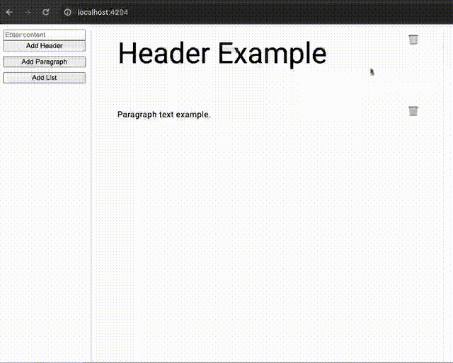
ng serveThis will compile the app and make it available at http://localhost:4200/—open a browser tab and navigate to that address. You should see the basic layout of the website builder, including the drag-and-drop functionality provided by the Material CDK.
If everything has been set up correctly, you'll be able to add elements to the canvas, move them around, and delete them as needed. This proof-of-concept can now be extended to a more feature-rich web page builder.
Conclusion
By leveraging Angular's Material CDK library, we have created a simple but flexible drag-and-drop web page builder. This serves as a proof-of-concept for how powerful Angular can be when creating interactive, dynamic applications. With further development, you could expand this app to include more sophisticated elements, advanced editing capabilities, and integration with a backend for saving user-built layouts. The possibilities are endless!